AmplifyChange
Visual Identity | Strategy | Website UI & UX | Website Design | Social media | Digital | Iconography
AmplifyChange provides support for those advocating to improve Sexual and Reproductive Health Rights (SRHR) and had recently transformed to become an independent not-for-profit organisation. Through a decade of work, they’d evolved to become more than a fund but a partner to Southern civil society. This was a milestone moment and a brand refresh would be an opportunity to show this evolution and strengthen their reputation as a global leader in SRHR.
We began with extensive research through audits, stakeholder interviews and audience questionnaires. The big challenges faced were the alarming global rollback of sexual and reproductive health and rights (Roe v. Wade) and the global economic downturn making funding harder. It was essential the brand showcased value to donors and championed grantee success stories to motivate activists. The strategy workshop created alignment and established an emotive narrative: that AmplifyChange is more than a fund but a partner and movement-builder for the SRHR movement. The visual identity needed to place grantees central, address visual accessibility issues and feel less euro-centric.
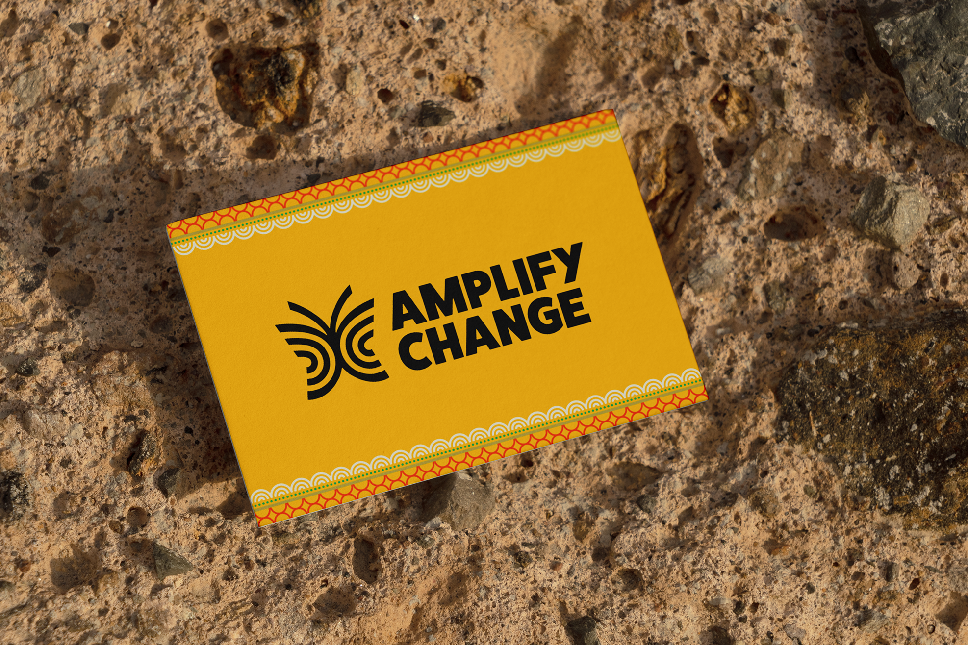
Their donors and grantee partners are spread across the globe, so we needed to create a logo which was universal. In many cultures butterflies are symbols of freedom, renewal and equality. Their metamorphosis symbolises positive transformation - what AmplifyChange and partners hope to achieve in the SRHR space. We evolved elements of the old brand such as the radiating lines and yellow to maintain brand recognition. The vibrant colour palette and patterns were inspired by South Asian and African textiles, to reflect the cultures of grantee partners placing them central to the brand.
‘‘The website has now been live for a week, and we’ve had some wonderful feedback from lots of our partners and grantee partners. The brand has been incredibly well received. Many have mentioned how it’s so clearly linked back to the old brand, but much more updated and refreshed. Everyone loves the new features that centres the grantee partners. Thank you again for all your work and support during this process. We’re so thrilled with the outcome!” Katie Northcott, Communications Manager, AmplifyChange
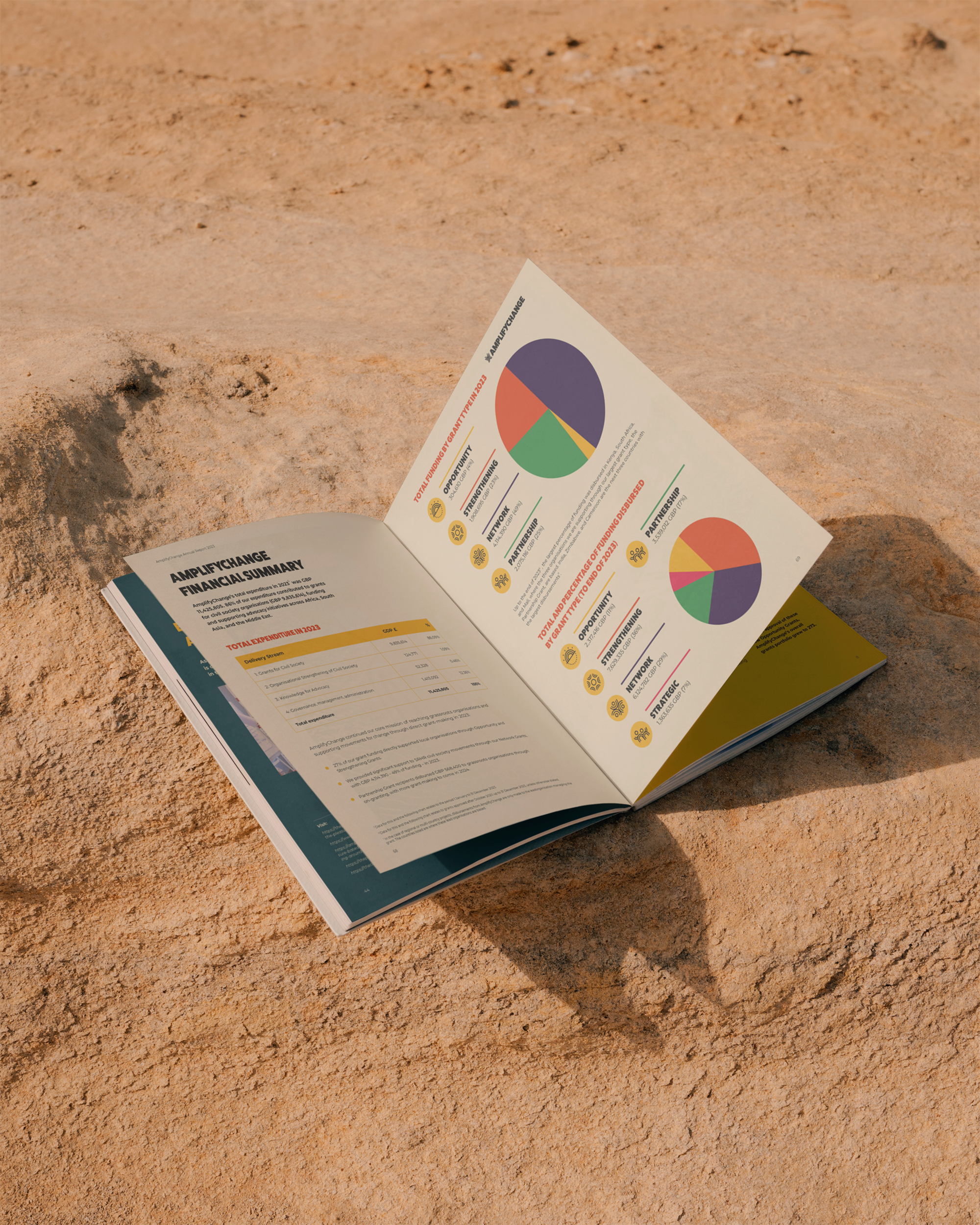
The radiating brand language was expanded to a suite of icons, covering priorities to grant types. We redesigned the website after extensive user research and data analysis. We reorganised content and built a new wireframe to make the site easier to navigate. We balanced the bold design with being accessible to ensure grantees with poor internet would be able to easily manoeuvre through the site. After user testing the finalised designs were built by Michael Palmer Web Design. The new website was deemed effective with engagement times significantly up helping AmplifyChange to support more grassroots organisations. The refreshed brand received glowing feedback from grantee partners, donors and the internal team. The brand refresh was deemed a triumph, so we collaborated again to refresh their learning platform ‘AmplifyChange Learn’. The visual identity places AmplifyChange’s vision at the heart, that they’re more than a fund but a movement builder driven to attain SRHR for all. To view the full website visit www.amplifychange.org


